A Failure to a Vibrant Review
Last year I went to the Denver Botanic Gardens to take some pictures of their waterlilies. I wondered all around snapping a picture of anything I thought would be worth painting or using for reference. I came upon some lovely dahlias, one of my favorite flowers. Earlier this summer I dug through my photographs looking for something vibrant to paint and stumbled on those pictures. I has never painted a dahlia before and thought it would a great exercise for me.
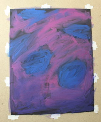
I started the painting as usual, a vibrant ink under-painting and layered in my darks. As I moved on to the blooms, I found myself struggling. Not giving up, I wiped my sheet clean and wiped it with water to start over. I struggled again. I kept pushing through, hoping it was just a phase of the painting. After letting it sit for a while, I decided I just needed to focus on the flower itself.


Taking a Step Back
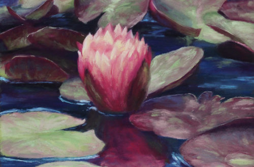
This was my breakthrough. My new painting was going to be a study of the flower while trying out a new set of pastels, Terry Ludwig’s Vibrants. I received those pastels as a Christmas gift in 2018 and was dyeing to try them all out. I started with a very bold background color, something my flower could pop on. My first attempts at the petals were not great. So I kept at it, getting a more comfortable with how this set of pastels worked.
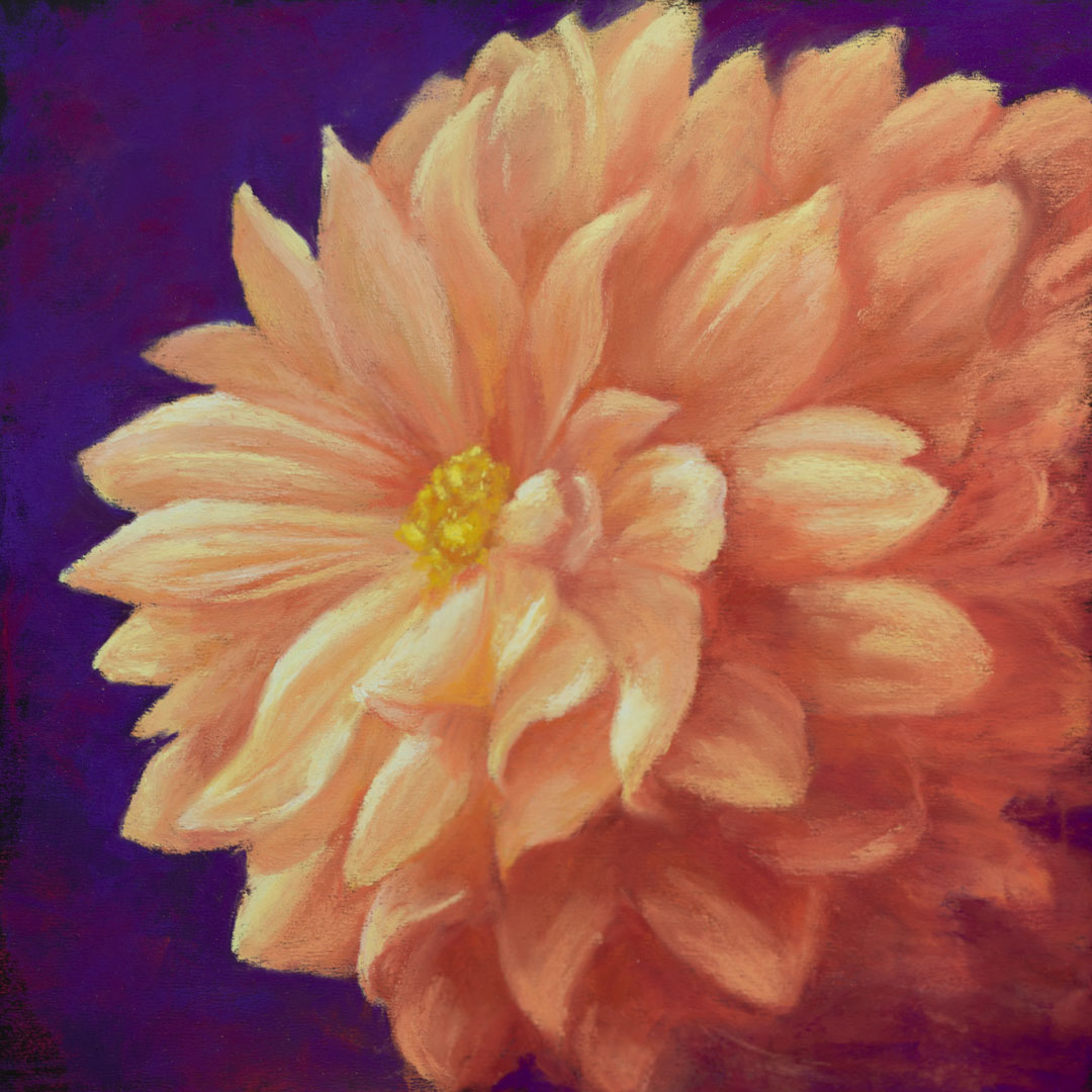
12″x12″
After the dahlia painting was finished my mom loved it so much she wanted to know if I was going to do anymore. Keeping with the square theme and bold colors, I continued my evaluation of the Terry Ludwig pastels. My next two paintings explored the range of colors this set had to offer.
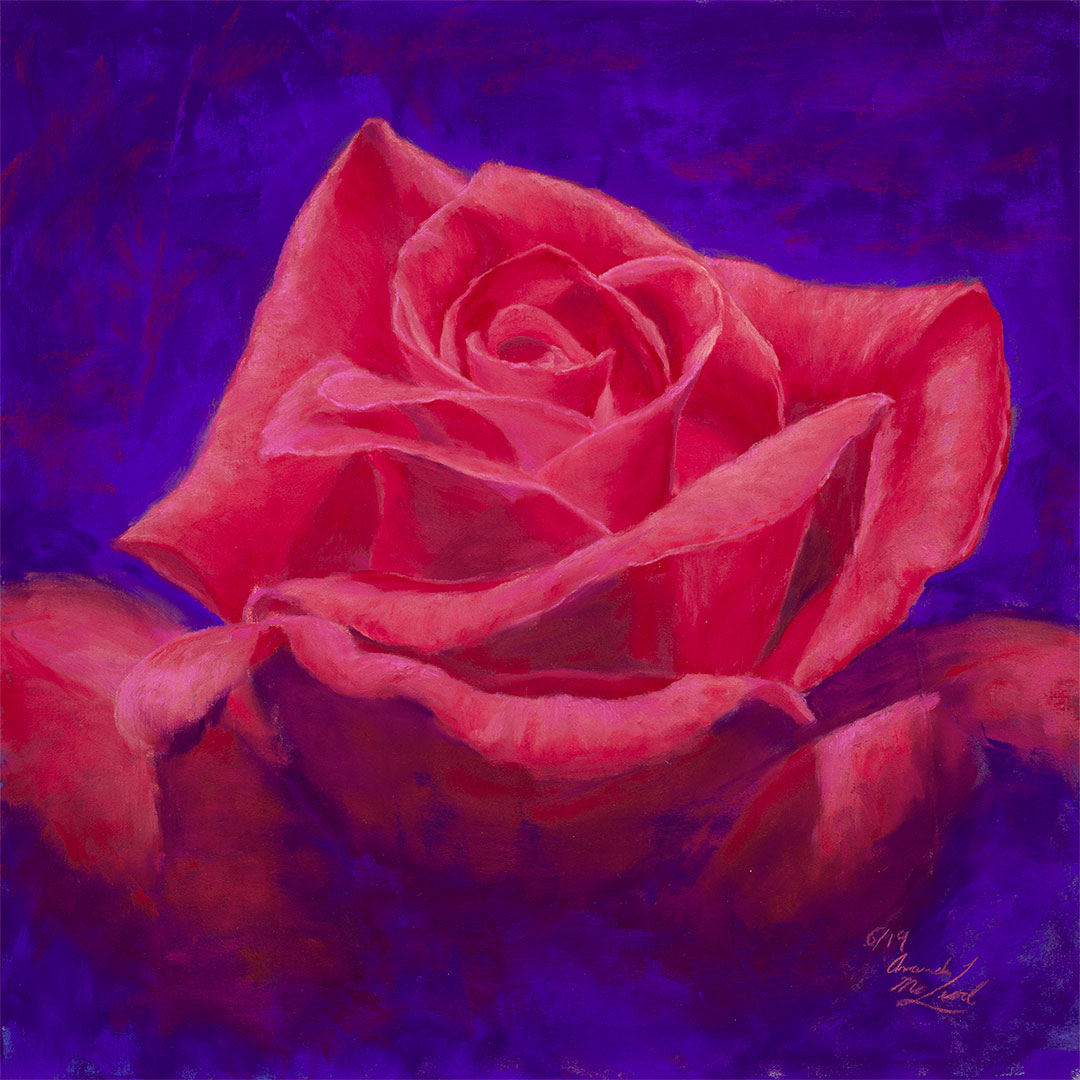
12″x12″
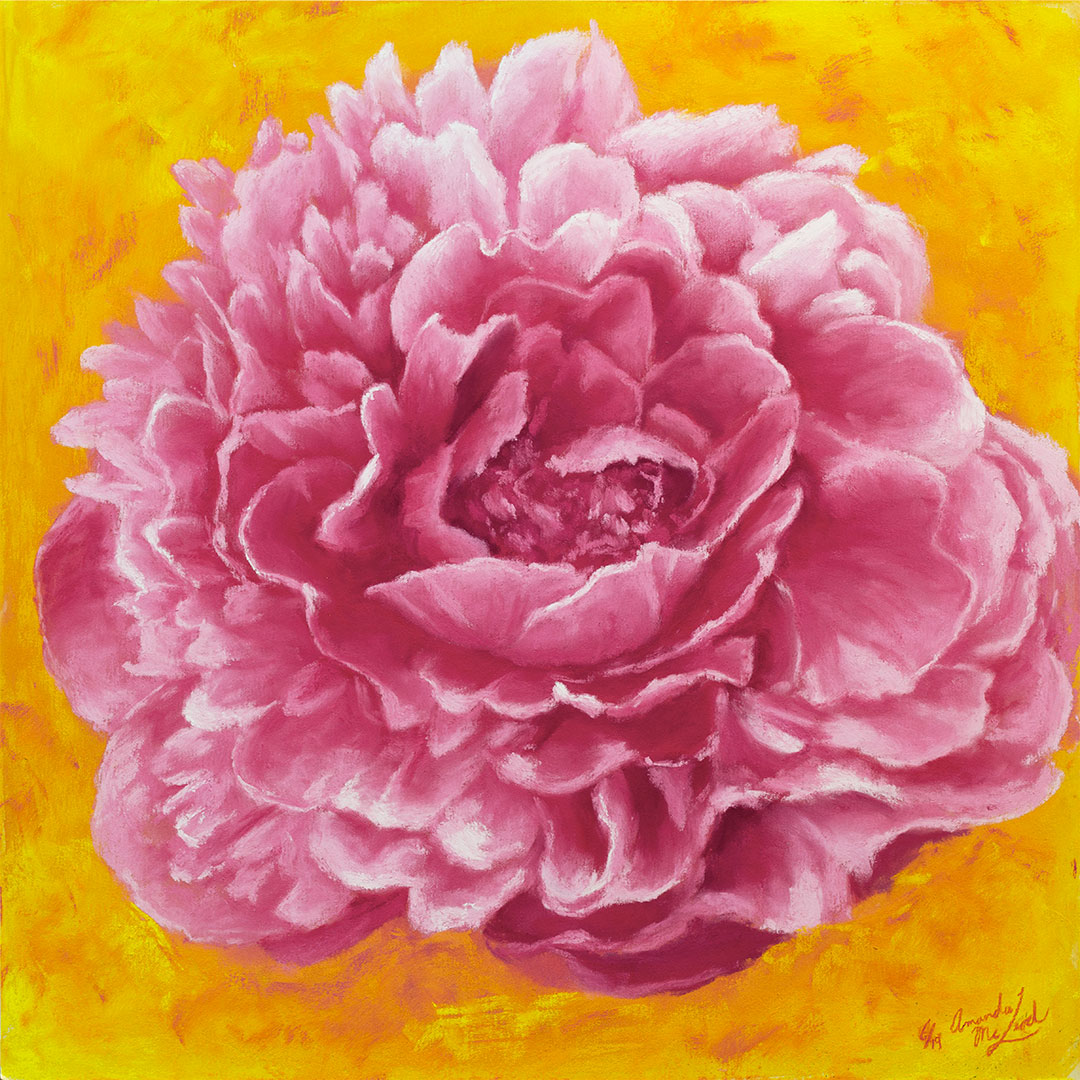
12″x12″
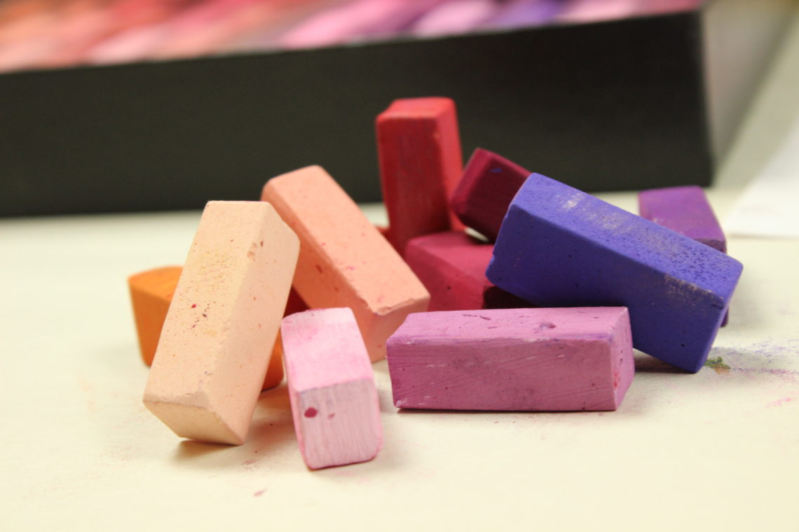
A Set for Bold Paintings

This set has a wonderful collection of warm vibrant colors with a great range of value. From tasteful oranges to seductive violets, this set is a must for those who want to add a

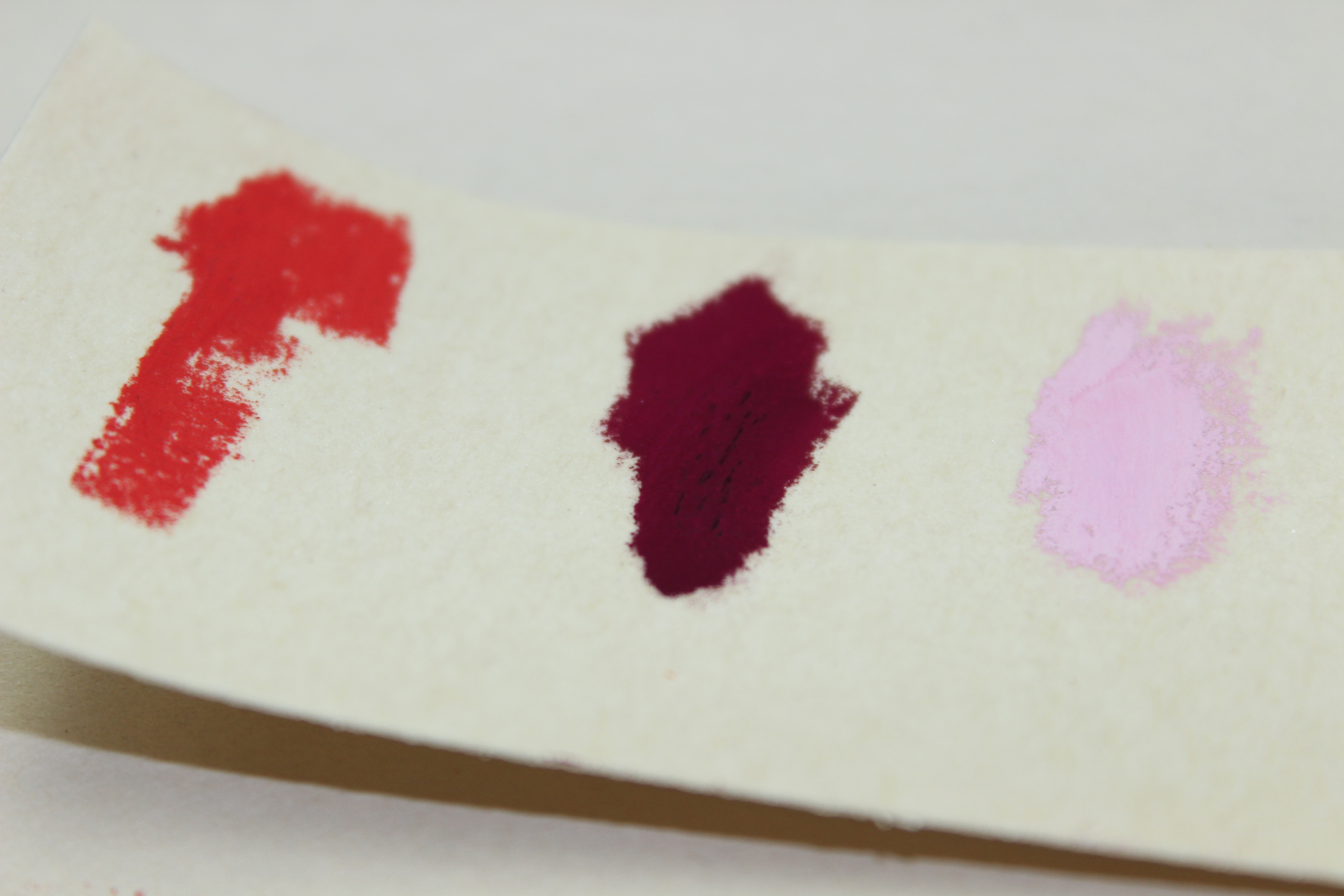
Working with these colors I’ve found the darker values need more care in layering. A heavy hand will build the pastel up into hard tiny bumps. I had to use a palette knife to scrap them off. The most troublesome ones were the deep violets and magentas. These colors just required a lighter and more decisive touch. The deeper colors lean to the harder side of Terry Ludwig’s pastels. This makes them great for sharper edges and more defined marks.
Aside from learning more about this set, I learned more about flower petals. How the petals curve around the base and the semi-transparency of them. I absolutely love these colors and have so many more paintings I want to use them for. If you all like my work and want to follow my art career and lifestyle please be sure to join my email list for new work, festivals I’m attending and updates.