Elven Maiden Process
Process Work for Elven Maiden
I had a wild hair one day in June to do this elegant piece of a regal elf. I envisioned her taking a stroll through a garden with a soft light playing across her skin. So I set my camera up and threw a on dress with jewelry. I had a small thumbnail of what she should look like, which I ended up deviating. I took advantage of the north light from the kitchen slider. After a better sketch I set up an 18″x24″ UART 400 grit pastel paper. I wanted something large to work on but nothing intimidating since I hadn’t work this large in a while with pastels.
Block-in Stage
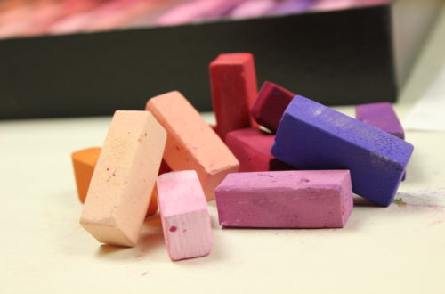
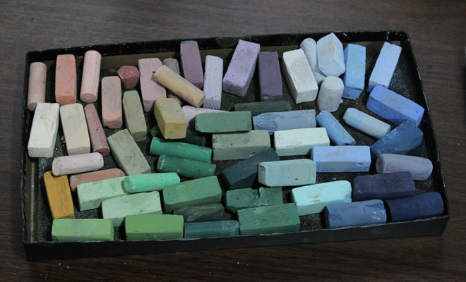
These are the colors I started with, nothing glaringly bright. When I chose these colors, I tried finding a mid-tone, light and dark to each color. I did add others later on when I couldn’t find the right color with the ones I had previously selected.
For the under painting I used hard and soft pastels with an alcohol wash.
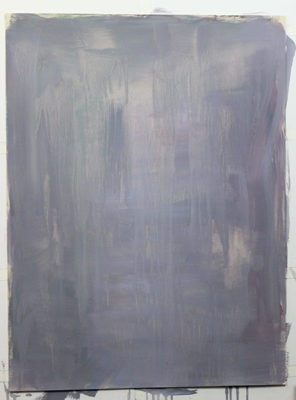
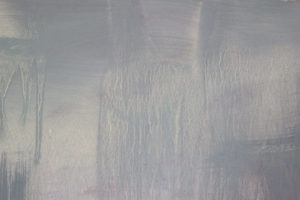
It created this wonderful grey purple tone. I loved the dripping effects from the rubbing alcohol. I thought about keeping them. However, in the end I covered all of it up. I’ll have to try and keep the spider vein effects in another project.
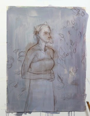
I roughed in my drawing next with a pastel pencil. I used a warm brown with a light touch that could be easily drawn over without affecting layer on top.
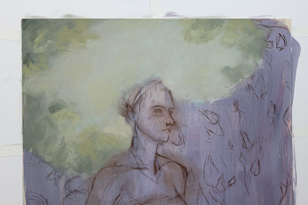
I immediately jumped in with the background. It’s sometimes easier to work background to foreground, top to bottom with pastels. This is because they are an opaque medium. Also working top to bottom helps keep the pastel dust from falling on your finished areas.
After reviewing my first attempt at the background. I disliked the colors I use. So I scrubbed it out with water and an old brush and started over.
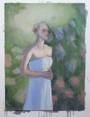
This time I decided to do a rough color block in with an alcohol wash. This will help me get a general feel of the composition. AS my blocking in my colors I’m keeping my shadows all a similar tone. This helps creates the illusion that everything is in the same space with the same lighting.
Color the Background
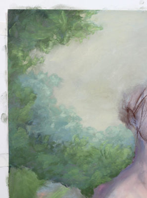
My second attempt at the background. I kept the colors cooler, less saturated and more green to push them back. With pastels I tend to layer them from the shadows to the highlights because pastels are naturally light. It is harder to get darker and more intense colors with them. Keeping those colors separate from you lights helps keep them saturated.
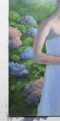
I quickly lay in my hydrangea with short strokes, mixing the greens into the flowers themselves.
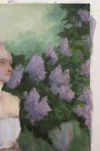
For the lilacs I use the same shadow colors but a different mid-tone value to give a better sense that this is a different plant. I also use the same blues and purples from the hydrangea to unify the composition.
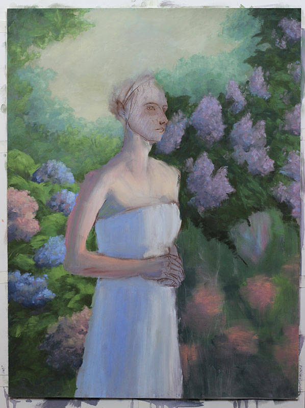
So far, I’m happy with how the piece is coming on along. I’m still unsure of how I’ll tackle the bottom right flowers. I leave them alone until I finish the girl.
Pale Skin Tones and Dresses
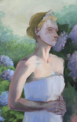
After I have a good sense of the background and its’ colors, I further block in the girl’s skin tones. At this point I’m trying to get a good feel for the values and the undertone colors. Skin is semi-opaque which means some light will pass through it creating these translucent colors in the skin.
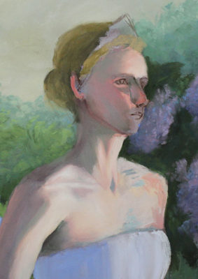
Moving on with the face, I block it in with some vibrant colors knowing that they will be the under coloring for the cheeks. I added in some more color into the shoulder to help the form turn, such as her shoulder wrapping around.
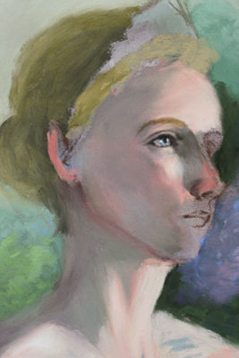
At this stage, I decide to work on the face to its final stage. I might make a few changes later on but nothing serious.
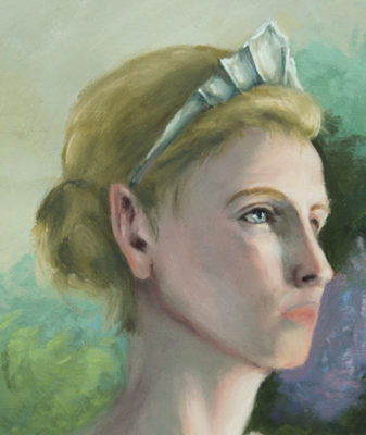
Since I was having some issues with the mouth, I left it alone and moved on to the rest of the body.
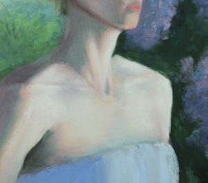
When you’re dealing with pale skin and a cool light source, the colors are not always dulled out. Instead, where the form starts to turn into the shadow there needs to be a higher intensity of color. I have all sorts of color going on with the skin. I also don’t use just pure white; instead, I use a soft pink then highlight it with a pale turquoise. Putting a cool highlight on top of a warm tone makes it pop even more.
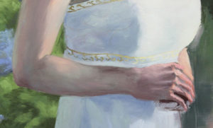
Here I have finished the arm and blocked in the hands. The white dress is almost done except for a few details. After this, I had stopped taking photos. The rest was mainly finishing up small details but the process was the same, building ups layers from the shadows into the highlights.
Elven Maiden Final & Close Up Details

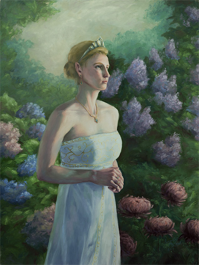
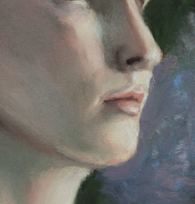
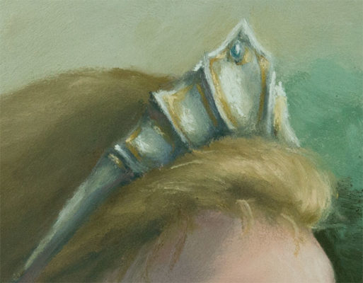
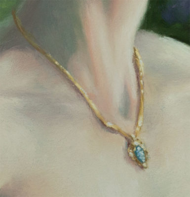
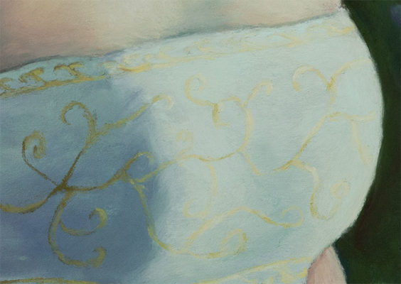
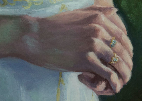
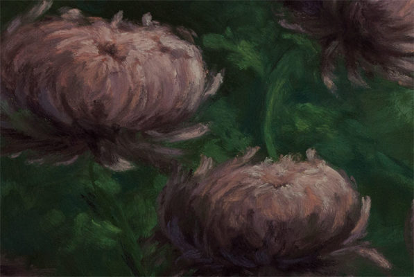
The finished piece. This took me a about 2-3 months to complete with on and off work. As I worked on this piece I kept reusing colors in all areas of the painting. This helped me keep color harmony even though character is pale skin and wears a white dress. Greens and pinks creep into the undertones of the dress and skin. The flowers and leaves all have intertwining colors. Below are close-ups of the final.
Final Thoughts
Looking back on this piece, there are things I like about it and plenty of others I wish I had done differently. Besides that, I learned a lot from this piece that I’ll carry on into future illustrations.
