Portrait Challenge in Oils: Specific Color Palettes
Creating a Challenge for Yourself
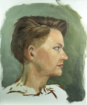
Portraits can be daunting. You have to get them just right. The slightest thing off and people will notice it immediately. They won’t know why, they’ll just know. That’s the problem when working with a subject people see every day. They instantly recognize it without consciously thinking about it.
This is why so many artists obsess over painting faces. For it represents us; humanity has been infatuated with itself for thousands of year. Secondly, people’s faces convey the most emotion out of the entire body and are usually the most distinguishing feature. That’s why I’m creating a challenge for myself focused on portraits. Not just a portrait in charcoal or simple sketch. Rather a challenge with specific boundaries.
Why start a challenge?
I love drawing or painting faces, but I began to notice a similarity in a lot of portraits I drew from my head. Similar noses, eyes or head shapes. I can say I’m decent with heads and faces, but I’m certainly no master at painting them. Hence the reason why I’m creating a challenge for myself; to better myself as an artist.
Setting up a challenge or a goal for yourself is one way you can better yourself. A challenge is great because you can easily measure it. When you can put hard facts like numbers to a soft skill, you put your growth into something tactile rather than “do my drawings look better than they did a week ago?” Making an objective concrete with something you can simply measure makes goals more attainable. I’ll talk about this subject in later posts.
Colorful Faces
With this challenge, I’m going to add onto it just a little. My time frame will be four weeks. I’ll paint the portraits in oil. Each week I’ll focus on a different color palette. Week 1: Dead Color Palette (limited palette), Week 2: Warm Colors, Week 3: Cool Colors, Week 4: Bright Colors.
So for the first week, I’ll be working with a limited color palette, dead colors. This actually was the first oil color palette I worked with in my life painting classes. The reason why we called it a dead color palette is because the colors used are not very bright compared to others.
Colors used:
- Titanium White
- Ocher Yellow
- Raw Umber
- Brunt Umber
- Brunt Sienna
- Indian Red
- Payne’s Grey
- Mars Black
We would make five color strings from these paints. A color string is a selection or mixture of colors that represents the value range of a specific color hue. Look at the picture below and see the color strings I created back in college with the dead color palette
This was an easier step into painting the figure rather than using a full color palette. I won’t be creating the color strings as I work on the portraits. Instead I just use the colors straight from the tubes. I like to work with this limited palette because it forces me to rely more on my values and really push the color intensity of each pigment.
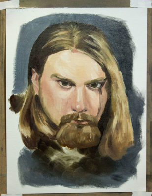
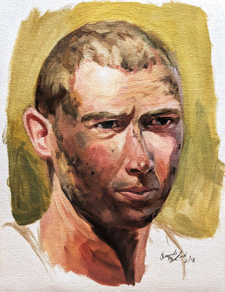
Here’s day #1.
You all can follow me on Instagram @amcleodart and Twitter @AMcLeod_Art to see each days painting. I’ll be writting another post next week on Monday talking about the previous week’s colors and what the following week’s focus will be. You all can get notifications about my blog by signing up with your email.
Photography credits for reference go to carlviking on Deviant Art
